Netflix Power BI Dashboard
Project Overview
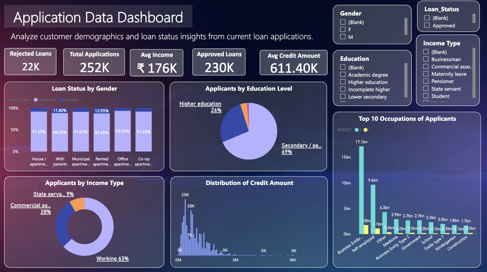
In today's data-driven world, storytelling with data is just as important as the analysis itself. In this project, I built an interactive Netflix Dashboard in Power BI to explore thousands of titles from the popular streaming platform. Through a complete Exploratory Data Analysis (EDA) workflow – from cleaning and transforming raw data to designing insightful visualizations – this dashboard uncovers trends in Netflix's global content library. The goal is to highlight how Power BI can turn complex datasets into engaging visual stories, revealing insights about genres, ratings, countries, and content evolution over time.
Technologies & Skills Showcased
⚡ Power BI
⚡ Power Query
⚡ DAX
⚡ Data Visualization
⚡ EDA
Power BI Interactive Dashboard
Data Source & Tools
We're using the publicly available dataset from Kaggle:
- 📊 Dataset: Netflix Movies and TV Shows – Kaggle
- 🔧 Tool: Power BI Desktop 2025
- 📈 Records: Thousands of titles with metadata including name, type, cast, director, country, genre, and release date
What I Learned
Creating this dashboard was a fantastic learning experience. Here's what stood out:
- Power BI makes it easy to perform deep EDA visually – no coding required
- You can transform messy real-world datasets into meaningful stories with just drag-and-drop visuals
- Power Query Editor is powerful for cleaning and shaping data at scale
- Column profiling and cleaning with custom DAX for dynamic metrics
- Interactivity through slicers, tooltips, and filters gives users full control to explore insights